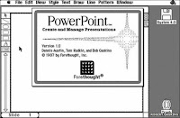
 PowerPoint has been the go-to business communication software program since its launch in 1987. Almost anyone can easily create a presentation to inform, educate or sell others.
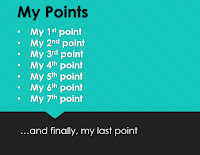
 There is a lot of advice on how to effectively use PowerPoint – focus on one thought per slide, limit the number of bullet points to 3 or 6 ('power of three'), use the least amount of slides as possible, etc..
There are also many tips on how to avoid misusing this tool – don't use a small font size, don't include complex, hard to read information like spreadsheets, don't use full sentences, etc.
The latest brain-related research has triggered a step-change in how PowerPoint presentations can convey meaning and gain influence:
- The brain processes visual information 60,000 times faster than the time it takes for the brain to decode text (SAGE Handbook of Political Communication)
- People retain almost 65% of visual information compared to 10-20% of written or spoken information (Dr. Lynell Burmark)
- 40% of people respond better to visual information than plain text (Zabisco)
- Using bullet-pointed text requires people to switch between reading and listening, exhausting their cognitive capabilities and decreases the likelihood of retaining the information (Dr. Chris Atherton)
- 90% of information entering the brain is non-verbal (Psychologist Albert Mehrabian)
- Presenters that use visuals are 43% more effective in persuading audience members to take a desired course of action (3M)
 So if the case for visuals over words is so conclusive, why do we create presentations that focus on words instead of visuals? One reason may be habit – I have always done it this way. Another may be limited access to compelling visuals or skills to use them. The biggest reason may be the lack of confidence in the ability of image-based presentations to support us. After all, a picture of a tiger may not remind us of the six bullet points we could use to convey agility.
A colleague and I are presenting a change management overview to a potential client next week. We decided to substitute most of our text with compelling visuals. We included just enough words to support a take-away deck.
I don't think we have gone far enough. For future briefing and learning session, we will use more visual metaphors and short phrases to help our audiences navigate the content and inspire conversations about it.
I don't think we have gone far enough. For future briefing and learning session, we will use more visual metaphors and short phrases to help our audiences navigate the content and inspire conversations about it.
PowerPoint was a tool created to help convey information leading to a desired outcome. Doing so with only words is like trying to to write a story with 35 percent of the available letters. Greater use of visuals will give you the benefit of the whole alphabet.
Phil
Phil


No comments:
Post a Comment